User Interface Speaker Selector
Contents
Description/Objective
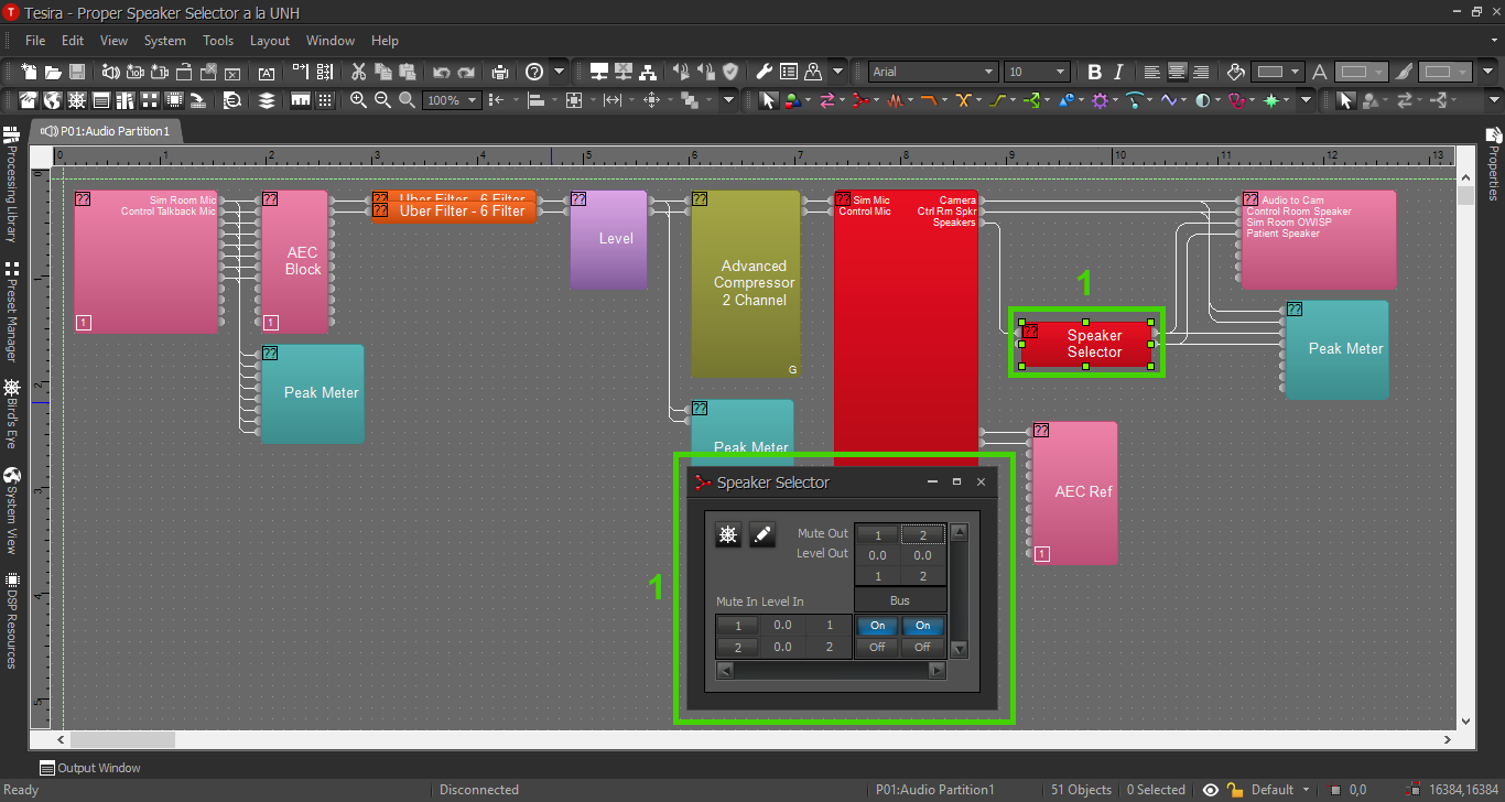
The Biamp Canvas User Interface software will allow a customer access to almost any parameters in the Tesira configuration. One use case that IVS will often be creating for a customer is a speaker selector - the ability to send audio from a push-to-talk mic to different speakers in a moment's notice.
In this section, we will build the corresponding Canvas UI for the Speaker Selector Tesira config. There is one camera, one sim room mic, one control room mic, one overhead speaker, one PSP in-wall patient speaker, and one control room PSP in-wall speaker. The customer would like to choose to send audio to the overhead speaker or the patient speaker, or mute the push-to-talk audio altogether.
Physical Wiring
Physical wiring and the line diagram is available in the Tesira config section for this example, so this should already be complete.
The only other thing to keep in mind is: The computers with the Biamp UI will need to be able to reach the Tesira on the network or over wifi (certain ports must be open for connectivity over wifi). Networking is typically be a task for the customer; IVS is only a guide in this matter.
Components
Open the Speaker Selector Tesira configuration.
Tesira
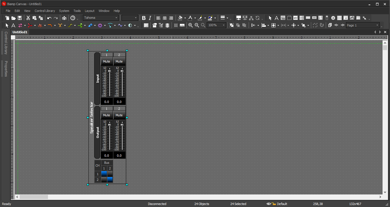
Copy the Standard Mixer and paste it into a blank Canvas file.
Canvas Blocks
A Standard Mixer as it first appears in Canvas.
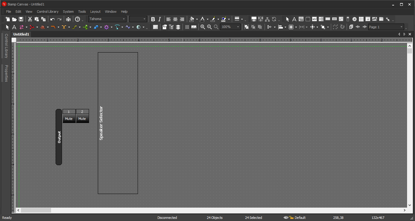
Ungroup the Buttons. Leave only the output channel names and mute buttons, and the large 'Speaker Selector' border.
Select each Mute button and update display properties. Since these are Mute buttons that we will use as Activate buttons, the parameters will be backwards.
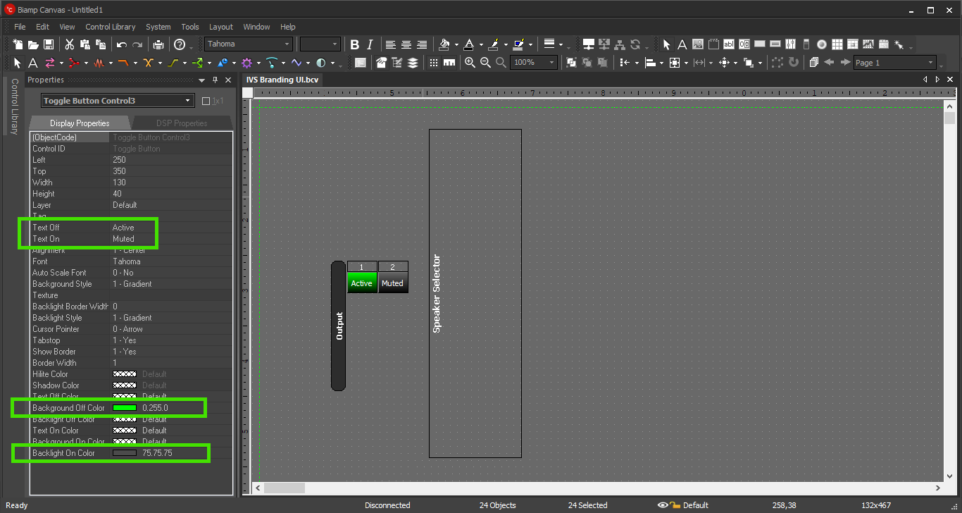
- In "Text Off", type Active
- In "Text On", type Muted
- In "Background Off Color", select green or blue (active state)
- In "Backlight On Color", select dark grey or even red (inactive state)
Other Elements
Use a static control to create a border around all user elements.
Use a picture control to add a logo for the customer if desired.
Use a button control to create an Exit option.
Appearance
Alter the elements to create an effective User Interface for the customer. An appropriate layout might look something like this:
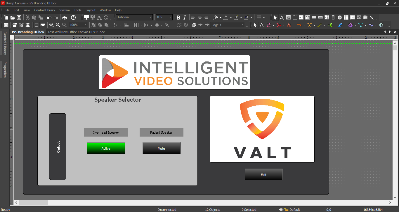
- The logos are simple image components in Canvas, for branding and appearance purposes. Upload the image(s) when creating the image components.
- Exit button. Once the UI config is complete, it should be set up to auto launch with a desktop icon (instructions in another section). The customer will not (or should not) have access to any menu, so an Exit button will be necessary (instructions in another section).
Canvas Settings
Click the image below for Canvas Settings and Auto-Connect: